


Published on by Crowd Favorite
*This article was originally published on Forty.co. Forty is now Crowd Favorite.
When designing website mockups, I always do my best to stick to a reasonable number of typography styles, and make sure there is clear intent behind the hierarchy and styles.
Doing so keeps the final result more consistent and it leads to cleaner development files. Basically, future-me will be a lot happier. But as the project hums along, and the number of Photoshop files starts stacking up, it gets tricky to remember the original intent with the style choices.
This led me to explore the idea of a basic style guide. I’ve read about web style guides in the past, but I always understood them to be large, complex documents created at the end of the design phase to pass off to developers. Totally intimidating. Plus, this didn’t solve my problem of keeping my own design direction in order along the way.
So with a recent web design project I spent some time mapping out what the different markup tags would be (based on the sketches) and what characteristics those tags would have. I did this before I even created the first layout file. I wouldn’t have guessed that determining the styles before even beginning the mockup would work very well, but I was pleasantly surprised!
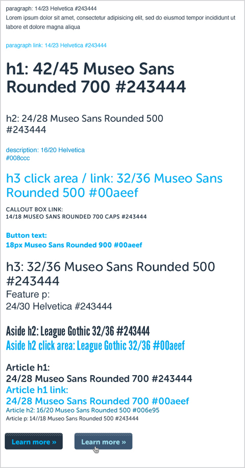
Sample web typography style guide
The developer, Jeremy, was happy with this new step as well. Instead of scouring the mockups for common font styles (and guessing when they were mis-matched slightly) they were all mapped out in one place.
I posed this idea on Twitter:
https://twitter.com/amylamp/status/124591693373771777
The response was positive:
@claytonlz said that the guide would help a lot during development, even more if developers didn’t have to do much to make it work. He and @markng also said that understanding the purpose and intent of the guide is important, referencing the Twitter Bootstrap CSS documentation.
@jerrythepunkrat mentioned that his team creates a UI style kit on web projects, including HTML/CSS for the typography, forms, and buttons. For naming these items, he suggestedconventions such as “has-gradient” or “big-search-btn”.
What I found was that by solving all of the different type styles that I could identify from the sketches, there was less decision making on the fly with each individual mockup. This led to more consistent layouts from one section to the next. And a happier future-me.
Written by
Amy Lamp
former Design Director
The same team and processes that made Forty synonymous with high-quality UX design and content strategy have been extended through integration with Crowd Favorite.
If you have a digital project in mind, now’s a great time to reach out!