


Published on by James Archer
*This article was originally published on Forty.co. Forty is now Crowd Favorite.
We recently redesigned our own website (on which you’re probably reading this article right now), and thought you might be interested in hearing about some of the technology elements running the background that help shape the overall user experience.
Ultra advanced front-end framework meets a trusted CMS
Our whole site is built using ZURB’s Foundation front-end framework, which is one of the sexiest things ever to happen on the internet. It’s hard to imagine that they could refine HTML, CSS, and JavaScript code to be so clean and lean and logical, but they did, and we’re happy to take advantage of it.
We chose WordPress as the back-end content management system for the site. It has some annoying quirks here and there, as any long-lived software package would, but overall WordPress remains among the most solid, flexible, and best supported content management systems in the world. It has served us well over the years (as it has about a fifth of the web), and we didn’t really consider any alternatives when it came to powering our new site.
Now, it may sound like a Foundation-based WordPress theme would be a slam dunk, but it definitely wasn’t that simple. We had a lot of requirements for this site that neither WordPress nor Foundation handled natively, and there’s a fair bit of custom JavaScript and PHP throughout the site as well.
Sass CSS preprocessor
We’ve done manual CSS for a long time, but after coming to understand the advantages Sass provides, and seeing that Foundation itself is built around Sass, it seemed like a logical progression for us.
A CSS pre-processor basically allows you to manage your code a bit more logically (using variables, etc.) and then to compile it into a standard flat CSS file for use on the site. It adds a few additional steps to the workflow, but can reduce complexity and save time overall.
Web fonts
We’ve never really felt comfortable with hosted web font services like Typekit, because we keep imagining that cataclysmic day when they shut down and thousands upon thousands of websites suddenly lose their fonts. Yikes.
For that reason, we purchased our web fonts outright and we host them ourselves,using @font-face to call them in the CSS. It’s a bit more effort, but it gives us the peace of mind that we’ll never have our typefaces randomly disappear.
(If anyone’s curious, Forty has used Joshua Darden‘s beautiful Freight family for almost all of Forty’s visual identity over the last several years.)
Web hosting
The site is hosted on Rackspace, which has a surprisingly affordable bare-bones virtual hosting service (i.e., they give you a Linux terminal command line, and the rest is up to you). We deployed the server and then set up a standard LAMP (Linux/Apache/MySQL/PHP) environment, with separate areas for Development and Production so we can test things before pushing them to our live site.
Once the dev site was mostly completed, we did some load testing with Load Impactand found that the site wasn’t performing as well as we wanted with its out-of-the-box configuration. So, we went in and tweaked the Apache configuration until we were getting stable speeds even at higher loads. It took some experimentation, but finally we got it where we wanted it.
Revision control
It’s a little tricky figuring out how best to handle something like a WordPress installation when it comes to revision control, because it’s not really a single body of code, but rather a collection of other code repositories (core, themes, plugins, etc.).
Our initial solution to the problem was to include only the custom WordPress theme files in the GitHub repository, but we’ll probably revisit that solution so we can include things like custom plugins and .htaccess files.
We’re currently cloning the theme files to our individual computers and then making changes and manually FTPing them to the development environment, but we’re also looking at other Git configuration options as well, particularly those that would allow a more straightforward deployment to the production server and reduce the number of points where inconsistencies could arise. (If you have any great ways to configure Git on WordPress environments, please let us know!)
Background videos
We knew we were going to face some technical challenges with the background videos on the site as soon as we started exploring that concept, but we were excited at the richer experience they could provide, so we went for it anyway.
All of the video was shot with a Canon T3i and 50mm and 30mm prime lenses. (There are a few of them that are still a bit choppy, but we’ll replace those over time.) All post-production was done in Adobe Premiere.
We had considered doing a CSS tint overlay like we had for some of the images on other pages, but we were concerned that might cause too much in-browser processing, so we manually tinted them in Premiere.
Reducing the video size without compromising quality was a beast; we’re still tinkering around with different approaches. We tried changing various parameters, but found it didn’t change the actual file size much, so we opted to leave them at a higher quality.
To help with cross-browser support, we converted the MP4 videos to Ogg Theora andWebM, then uploaded each format to Amazon S3 for hosting. While doing this, we encountered one obscure issue where Firefox wasn’t loading the videos correctly because Amazon S3 was reporting the incorrect mime type. Fortunately, this was a relatively easy fix.
Adaptive images
The great benefit of responsive design is that you can provide an elegant mobile experience without having to design a separate mobile site. However, if you’re still trying to deliver high-resolution imagery to a device that doesn’t need it, you can end up with a slow, cumbersome user experience.
The Foundation front-end framework we used offers a JavaScript solution that allows you to upload and specify different images to be used at different sizes, but we wanted something easier to manage, so we implemented Matt Wilcox’s Adaptive Images tool. It automatically scales and caches images at smaller sizes, and delivers them the next time they’re requested at that size, ensuring that the right images are going to the right devices without requiring much up-front effort.
Content distribution
To help the site load as quickly as possible, we used Amazon’s CloudFront content delivery service to duplicate key site assets (especially the videos, JavaScript, and CSS) around the world, so users will receive the data from the nearest datacenter to them, dramatically improving overall load times.
We considered using CloudFront for site images as well, but had to forgo that option when we decided to use the Adaptive Images tool to allow smaller images to cache locally on the server and provide a better experience for people using smaller screens as well. We still need to do some testing to determine whether Adaptive Images or CDN distribution is more efficient, but for now we’re comfortable with the way it’s set up.
CloudFlare almost made it in as our as a CDN solution (all these “Cloud” names get confusing, right?), but we found it was a little too automatic and interfered with some of the other things we were trying to do, so we stuck with CloudFront instead. It’s a really remarkable service, though, and definitely worth considering, depending on your needs.
Here’s a snapshot from Load Impact, which shows load times as the number of users increases:
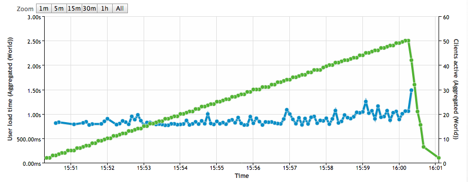
As you can see, it’s pretty steady at a nice fast speed! When we first ran this test on the unoptimized development server with no content distribution network, we were gettingway higher load times, and they climbed steadily with the user count. All the optimization work definitely seems to have paid off.
WordPress Plugins
If you’re curious, here are the WordPress plugins we’re currently using on the site:
- All In One Schema.org Rich Snippets
- OptionTree
- Spiffy Meta Box Creator
- Types
- W3 Total Cache
- Yoast WordPress SEO
301 Redirects
This most recent redesign represents the fifteenth version of our site since we opened our doors in 2003. As you might imagine, that leaves a tangled web of different URL structures to contend with. Every time we change our site, we’re very careful to create301 Redirects that tell search engines and browsers where to find the pages that moved around, but that starts to get a little crazy after 15 website versions.
For this version, we significantly cleaned up our .htaccess file, and got rid of a lot of redirects from versions past. Any search engine weight assigned to those old URLs had long ago been reassigned, and most of those backlinks were so old that nobody was clicking on them anyway. It was just getting too cumbersome to try to keep everythingattached from every site version over the years.
Besides, our 404 page is so dang cute that we didn’t really mind if some people landed on it. They’d have to forgive us, right?
The biggest challenge was definitely the Insights articles. We had gone through a massive editorial process to clean up, revise, and eliminate less-relevant blog posts, so we couldn’t just rewrite the old URLs to the new site structure. Many posts were removed, and others had changed names. So, one-by-one, we had to manually redirect all of the 120+ URLs to their equivalent pages on the new site. That was a bit rough.
Analytics
Google Analytics isn’t the most powerful web analytics tool out there, but for a site as small as ours it’s certainly appropriate.
One key feature that Google Analytics lacks, though, is the ability to see where people are clicking. There’s a rudimentary heatmap report that shows per-page link popularity, but it doesn’t do much to reveal usability problems.
To provide those fine-grained click maps, we also installed CrazyEgg, which shows all the clicks on a page, not just the link clicks. CrazyEgg’s reports already confirmed our suspicion that people are confusing one of the site’s design elements for a button, and clicking on it expecting it to go somewhere. That wouldn’t have shown up in our other web stats, but now we know and can design a solution for it.
To monitor server performance, we’ve also deployed New Relic, an app performance tracking system that helps us monitor overall server health, find scripts that are throwing errors in the background, see which scripts are contributing most to load time, etc.
Special Thanks
It takes a mighty team to accomplish a project like this one, but we’d particularly like to thank Jeremy Blaker, who did all the development on the site. This was a demanding project, and we were trying to stretch WordPress in ways it didn’t want to be stretched, but Jeremy figured out how to bend it to his will every time. He’s a remarkably talented individual, and we were privileged to have him with us on this project.
The same team and processes that made Forty synonymous with high-quality UX design and content strategy have been extended through integration with Crowd Favorite.
If you have a digital project in mind, now’s a great time to reach out!